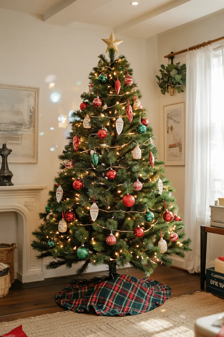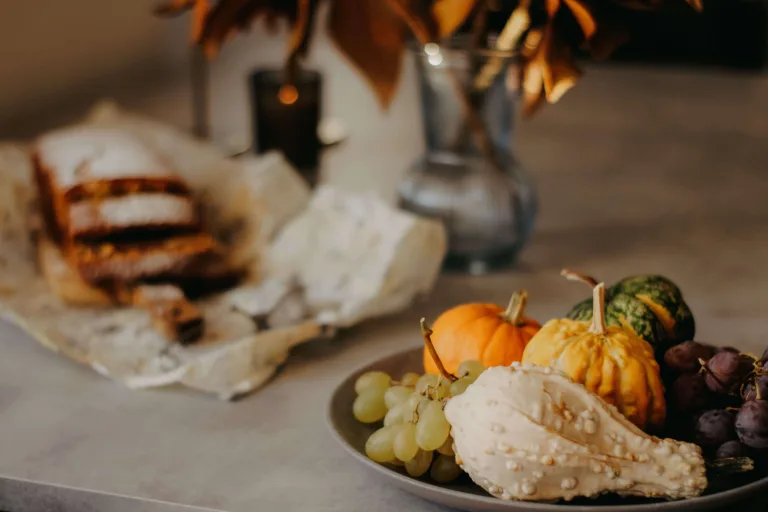
There’s a specific look that separates a porch that feels “decorated” from one that feels designed — and it almost never comes down to how much you spend. It comes down to restraint: a tight color palette, natural materials, varied textures, and a few well-chosen pieces instead of a dozen mismatched ones.
Below are sixteen ways to give your entryway that quiet, elevated, “did they hire a stylist?” look this fall — no big budget required.
1. Layer Oversized Urns with Textural Greenery
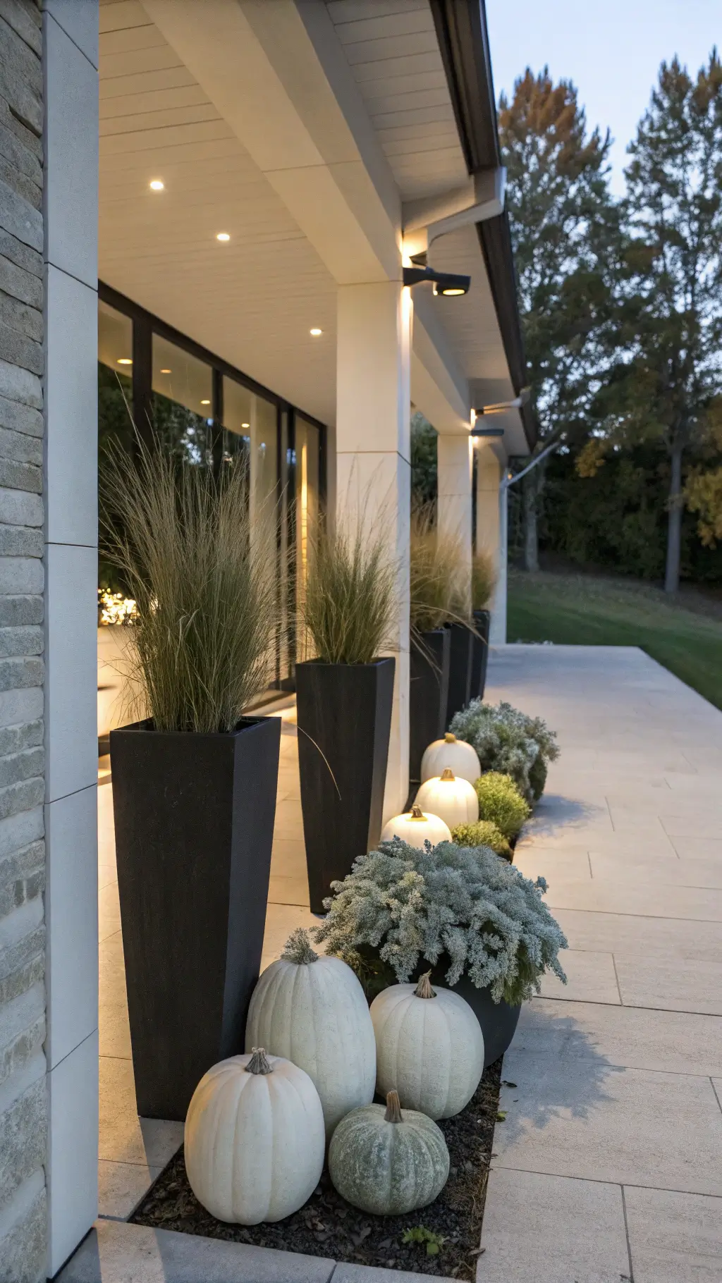
Skip the single potted mum. Cluster two or three oversized stone or concrete urns of varying heights near your entry, then fill them with feather reed grass, dried wheat, and a few branches in muted rust and olive tones.
Avoid bright orange — stick to cream, sage, and terracotta so the arrangement feels curated rather than seasonal clutter. Varying heights and odd numbers create visual rhythm without looking staged.

2. Choose a Monochromatic Pumpkin Display
Instead of a rainbow of orange pumpkins, pick a single tonal family — all white, all sage, or all warm caramel — in a range of sizes and shapes (some ribbed, some smooth, a few tiny gourds mixed in).

Stack them asymmetrically on your steps or nestle them into a low wooden crate. The uniform color makes the display feel gallery-like and intentional, rather than a grab-bag from the grocery store bin.
3. Group a Vintage-Inspired Lantern Collection
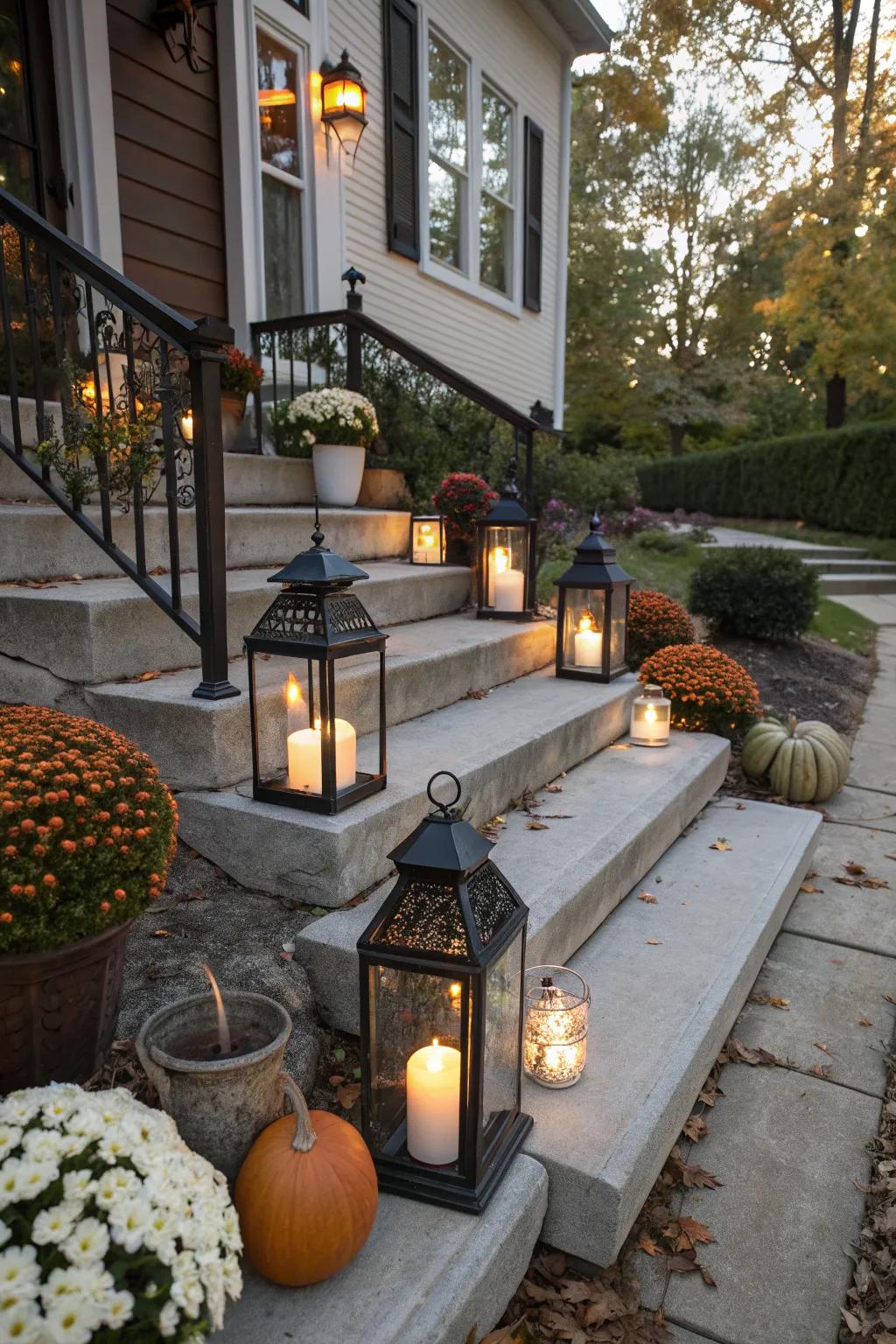
Line up three to five lanterns of varying heights — antique brass, aged iron, or weathered glass — along your steps or flanking your door. Fill them with flameless candles that flicker at dusk. The warm, low glow reads as expensive ambiance rather than a string of plastic lights.
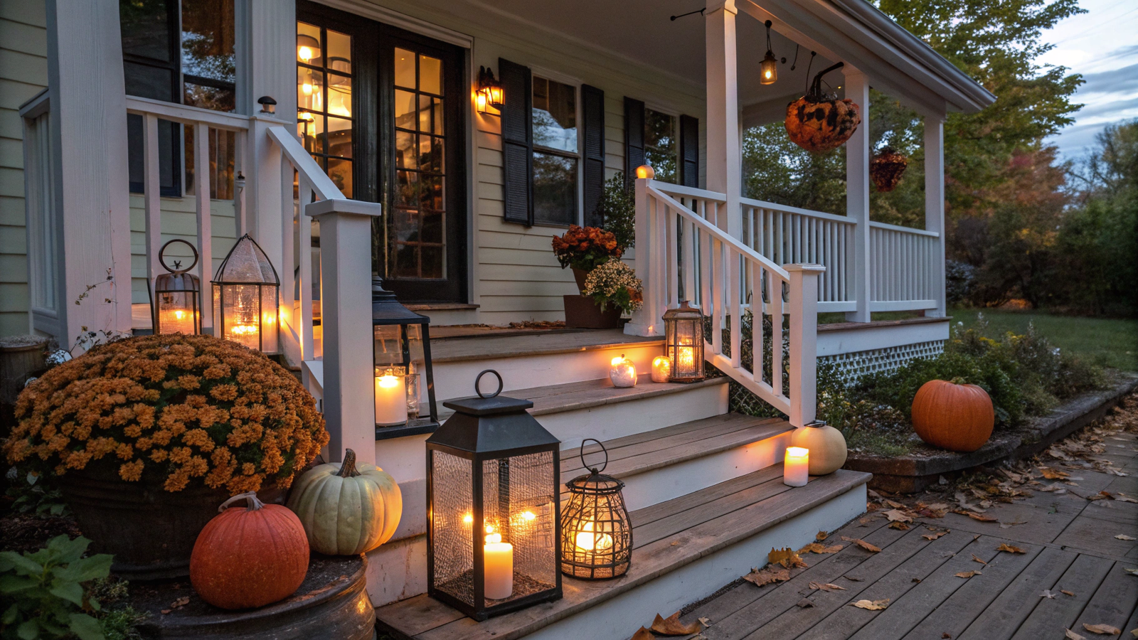
Look for a matte, oxidized finish rather than shiny new metal; that slight patina is what sells the high-end look.
4. Drape a Chunky Wool Throw Over a Bench

A single high-quality throw in oatmeal, camel, or charcoal, casually draped (not folded too perfectly) over a porch bench or rocking chair, adds instant coziness and a boutique-hotel feel.
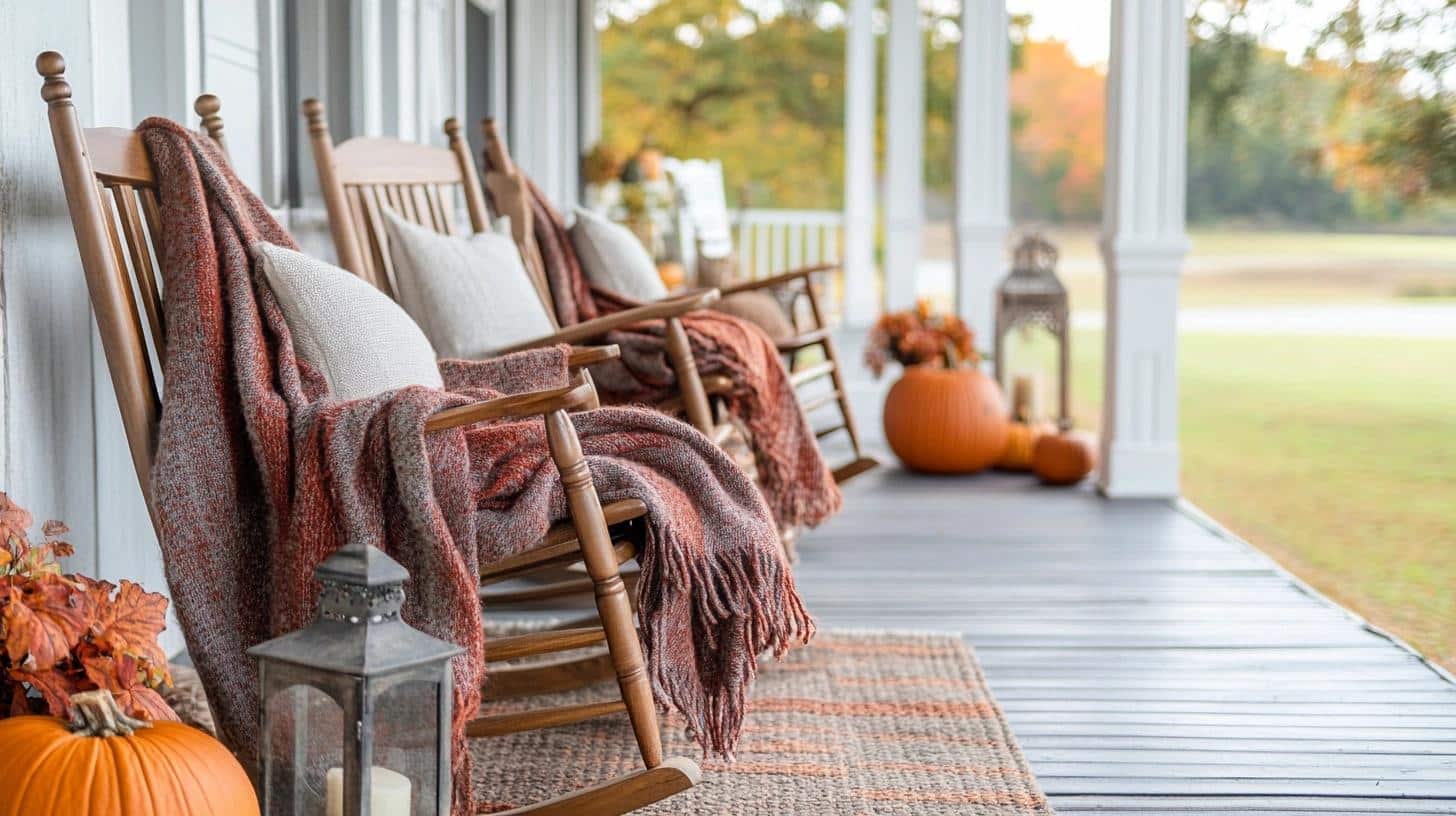
Choose a natural fiber like wool over synthetic fleece — the weight and texture are what separate “expensive” from “big-box store.” Pair it with two simple linen or canvas pillows in a complementary tone.
5. Bundle Dried Wheat, Pampas Grass, and Cotton Stems
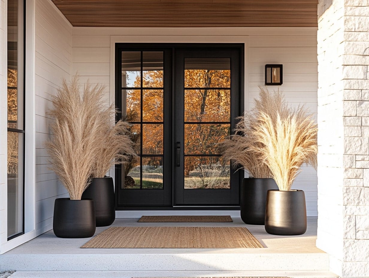
Skip the plastic fall floral picks. A simple bundle of dried pampas grass, wheat stalks, and cotton stems tied with jute twine and leaned in a tall vase or against the door frame brings texture without color overload.
Dried botanicals are inherently neutral and organic, so they automatically look more sophisticated than dyed silk leaves — and they last the whole season without wilting.
6. Hang a Wreath Built from Natural, Unexpected Textures
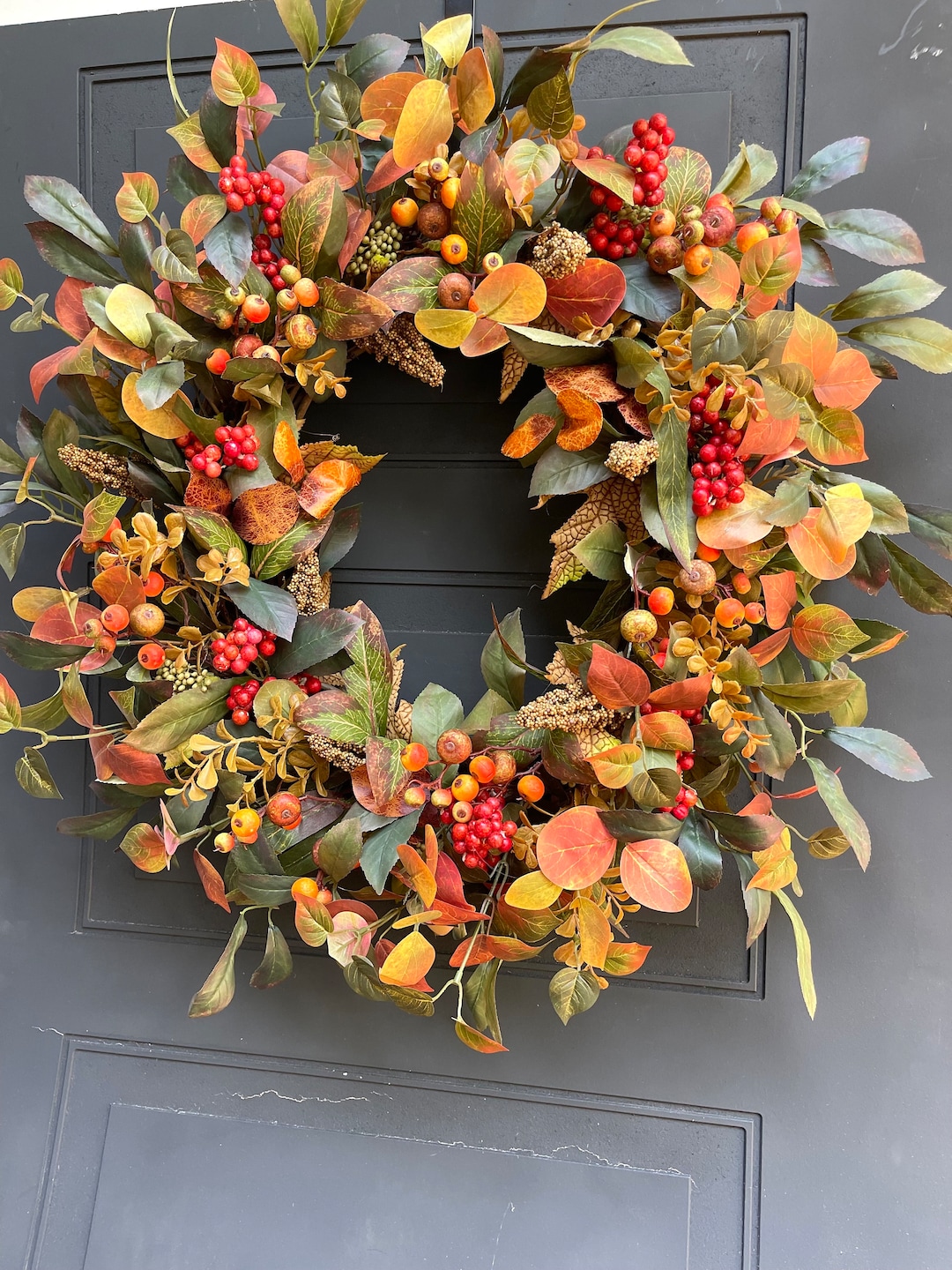
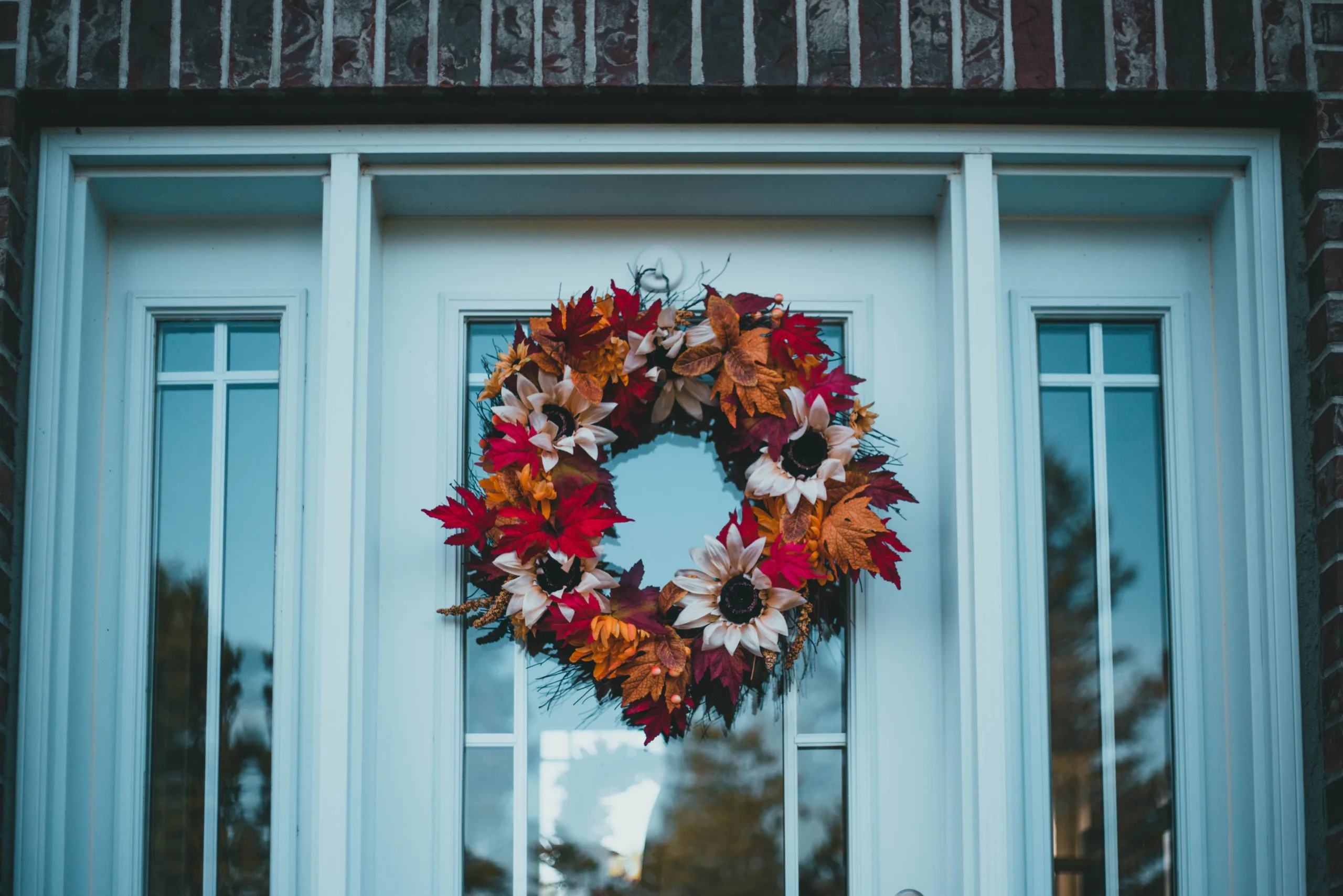
An expensive-looking wreath skips the plastic maple leaves entirely. Look for one built from dried eucalyptus, preserved boxwood, magnolia leaves, or artichokes and seed pods in muted tones.
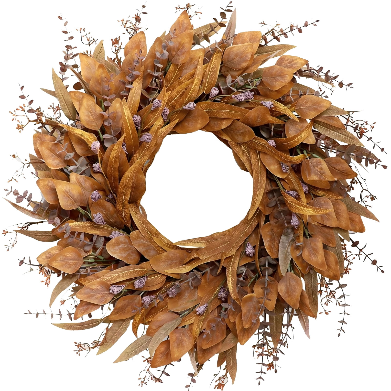
A wreath with real dimension and mixed textures, hung on a simple black or brass hook, feels like it came from a floral studio rather than a craft-store shelf.
7. Layer an Outdoor Rug Over a Neutral Base
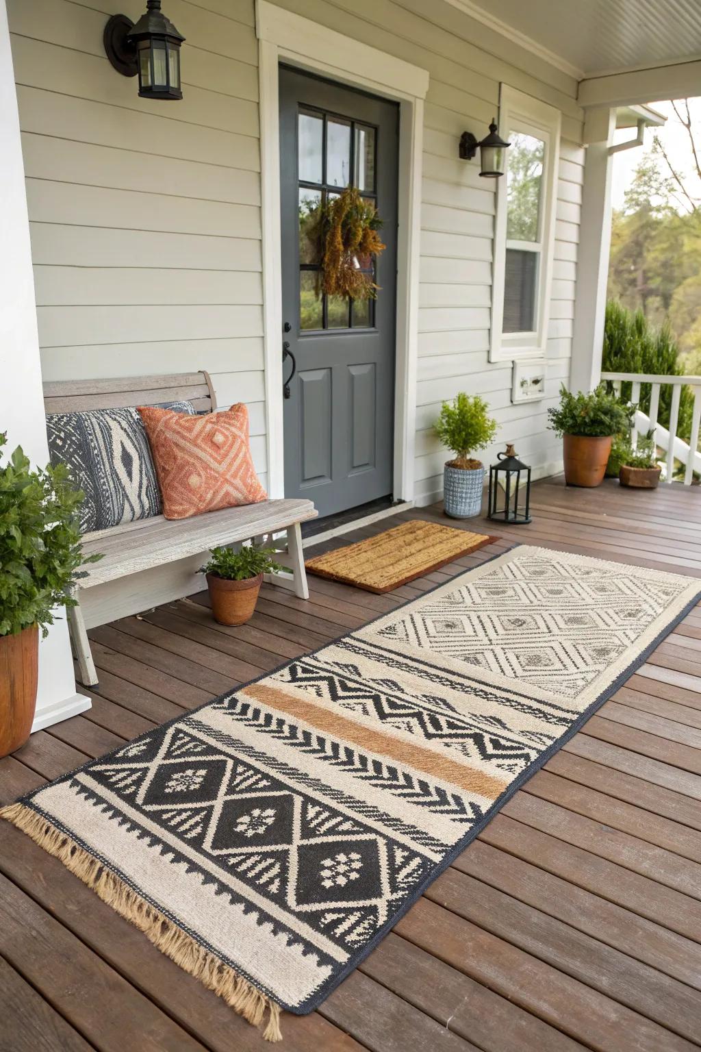
Placing a patterned or textured outdoor rug — a faded vintage-style print or a chunky natural-fiber weave — directly over your existing porch flooring adds instant polish.

Layering rugs is a designer trick used indoors and out: it grounds your seating area and makes even a small porch feel like a furnished room rather than a doorway you pass through.
8. Match a Pair of Topiaries in Identical Planters
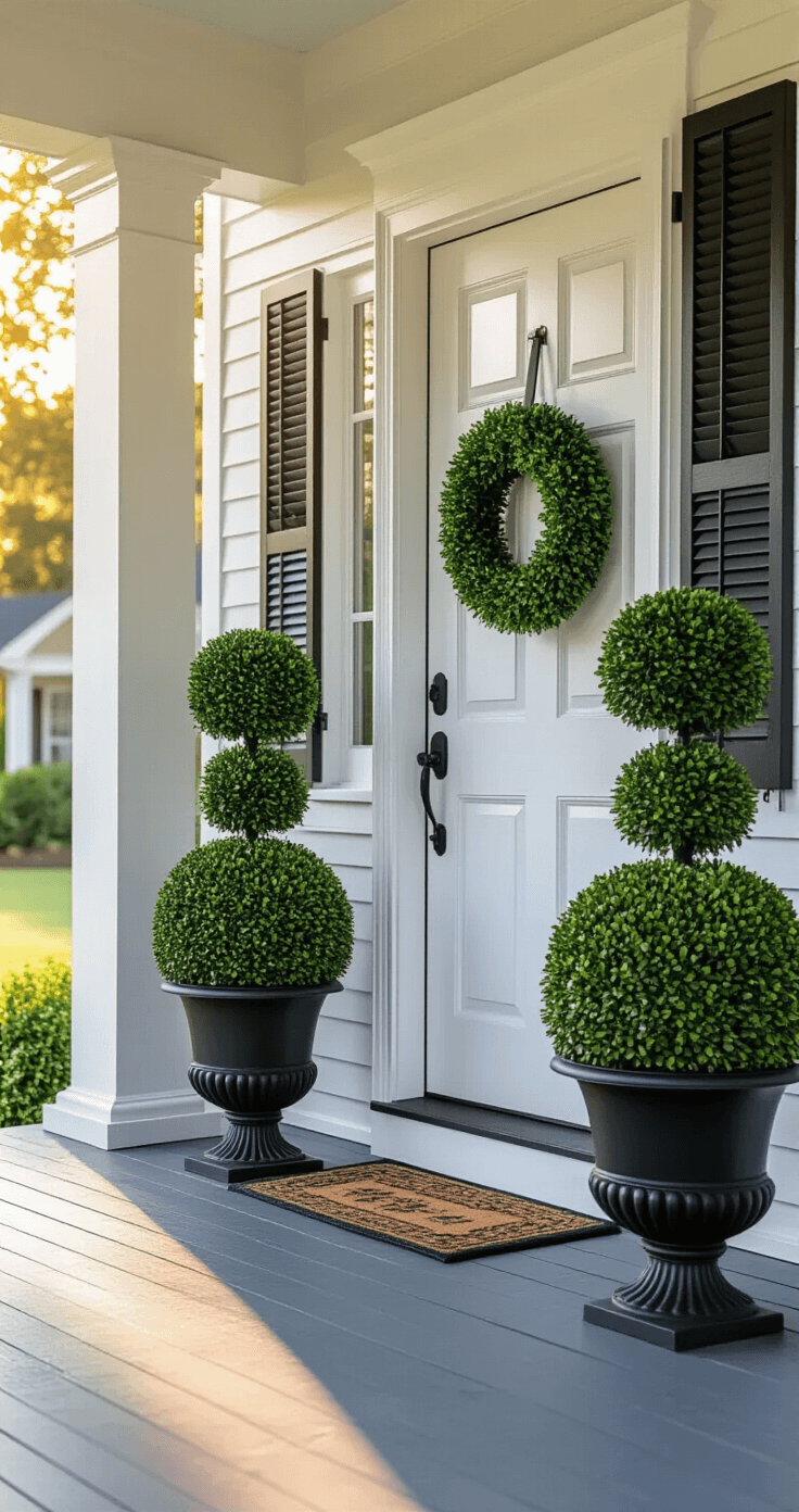
Symmetry reads as high-end. Flank your front door with two matching topiaries — boxwood, olive, or bay laurel — in identical planters, whether concrete, aged terracotta, or matte black.

The repetition and precision of a matched pair immediately elevates the entrance, the same way hotels and boutiques use matched greenery to frame their doors.
9. Create a Cozy Seating Nook with Woven Furniture
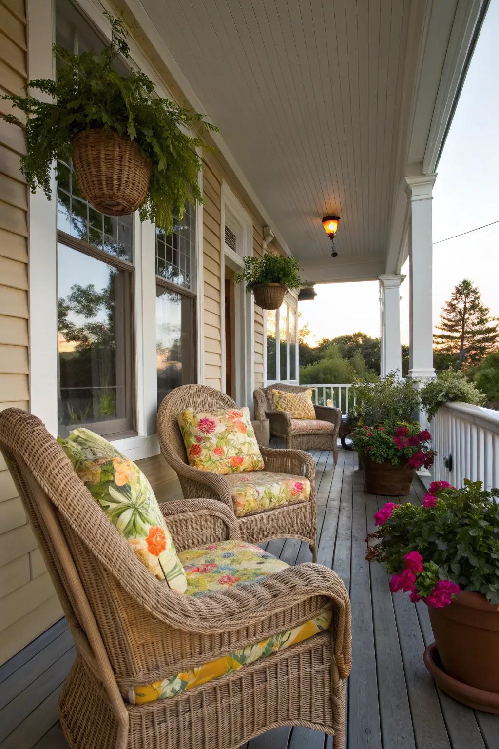
If your porch has room, add a small café-style bistro set or a cane or rattan chair with a cushion in a muted, natural tone.
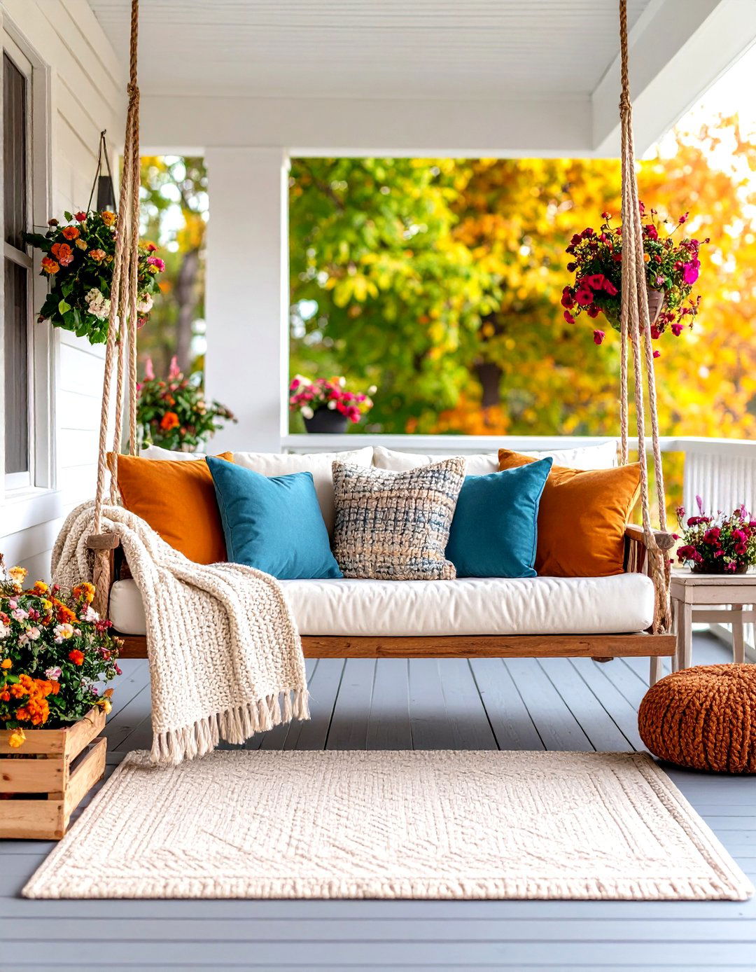
Woven textures have an inherently elevated, collected-over-time look compared to plastic patio furniture. Add a small side table for a candle or a stack of books to finish the vignette.
10. Add Warm Metal Accents in Brass or Aged Copper
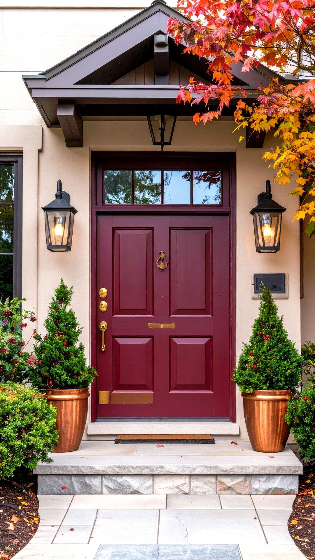
Small details make a big difference. Swap out a plain house-number plaque, mailbox, or door knocker for one in brushed brass or aged copper. Add a copper watering can or brass lantern to your grouping.
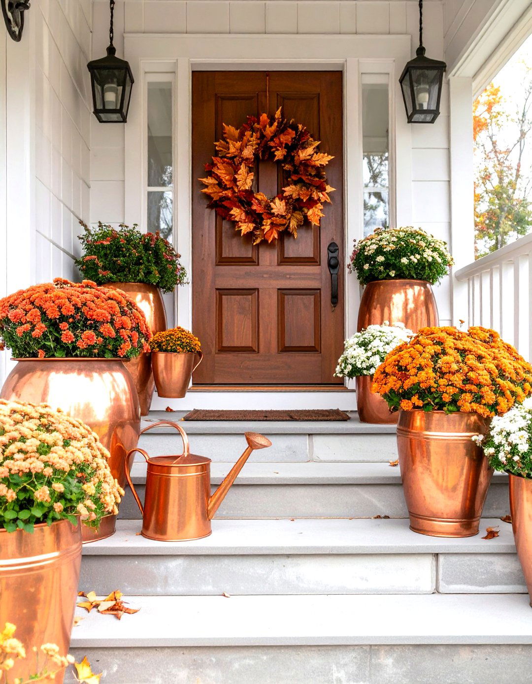
Warm metals catch the autumn light beautifully and instantly read as more considered than standard builder-grade black or silver hardware.
11. Style a Harvest Table Vignette by the Door
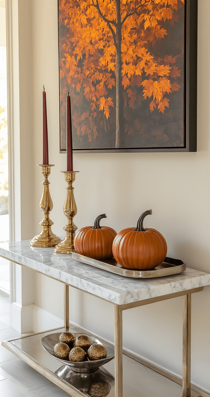
If you have space for a small console or accent table, style it like a still life: a stack of pumpkins, a few candlesticks, a small vase of dried florals, and a woven tray.

Keeping the color palette tight — two or three tones max — and varying the object heights creates a vignette that looks professionally styled instead of randomly placed.
12. Drape Trailing Greenery Along the Railing
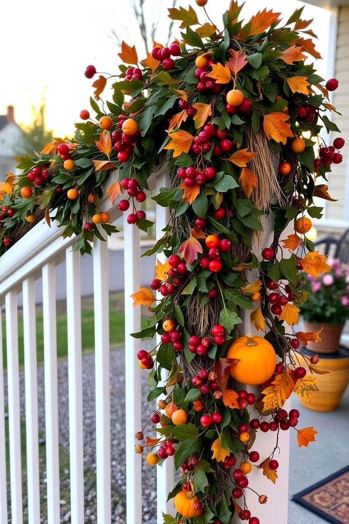
Fresh or high-quality faux eucalyptus, smilax, or ivy garland draped loosely along a porch railing or over the doorframe softens hard architectural lines and adds a lush, established feel — like the porch has always looked this good.
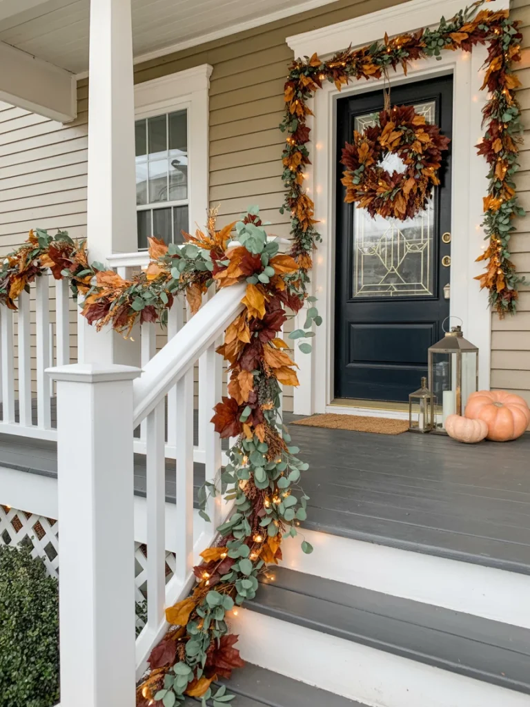
Secure it loosely with floral wire so it drapes naturally rather than sitting in a stiff, straight line.
13. Use Weathered Wood Crates as Plant Risers

Instead of setting pots directly on the ground, elevate a few at different heights using stacked wooden crates or a vintage step stool.
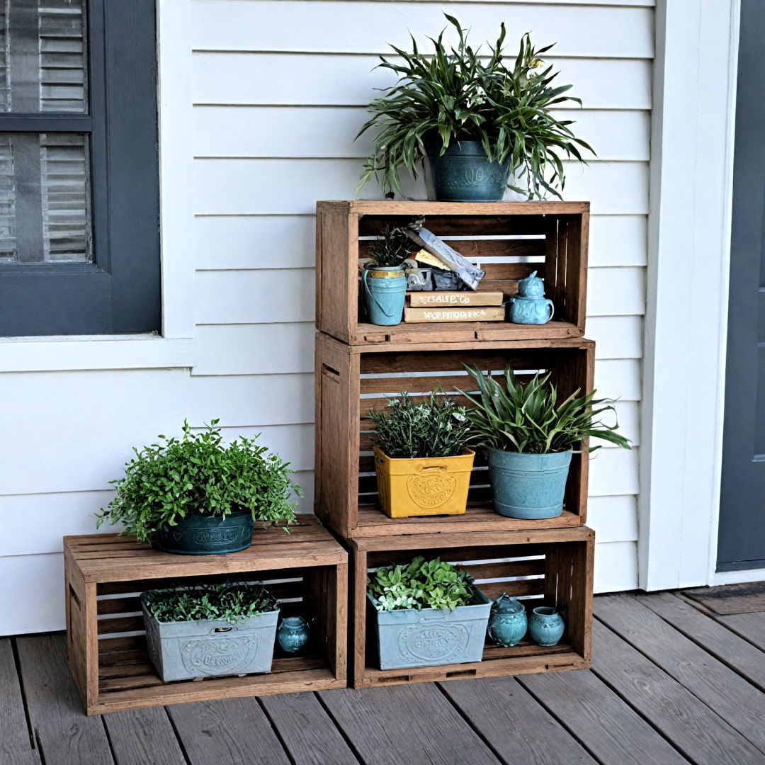
This creates dimension and draws the eye upward, mimicking the layered plant displays you’d see at a high-end nursery or garden shop rather than a flat row of pots along the wall.
14. Install Warm White String Lighting, Not Colorful Lights
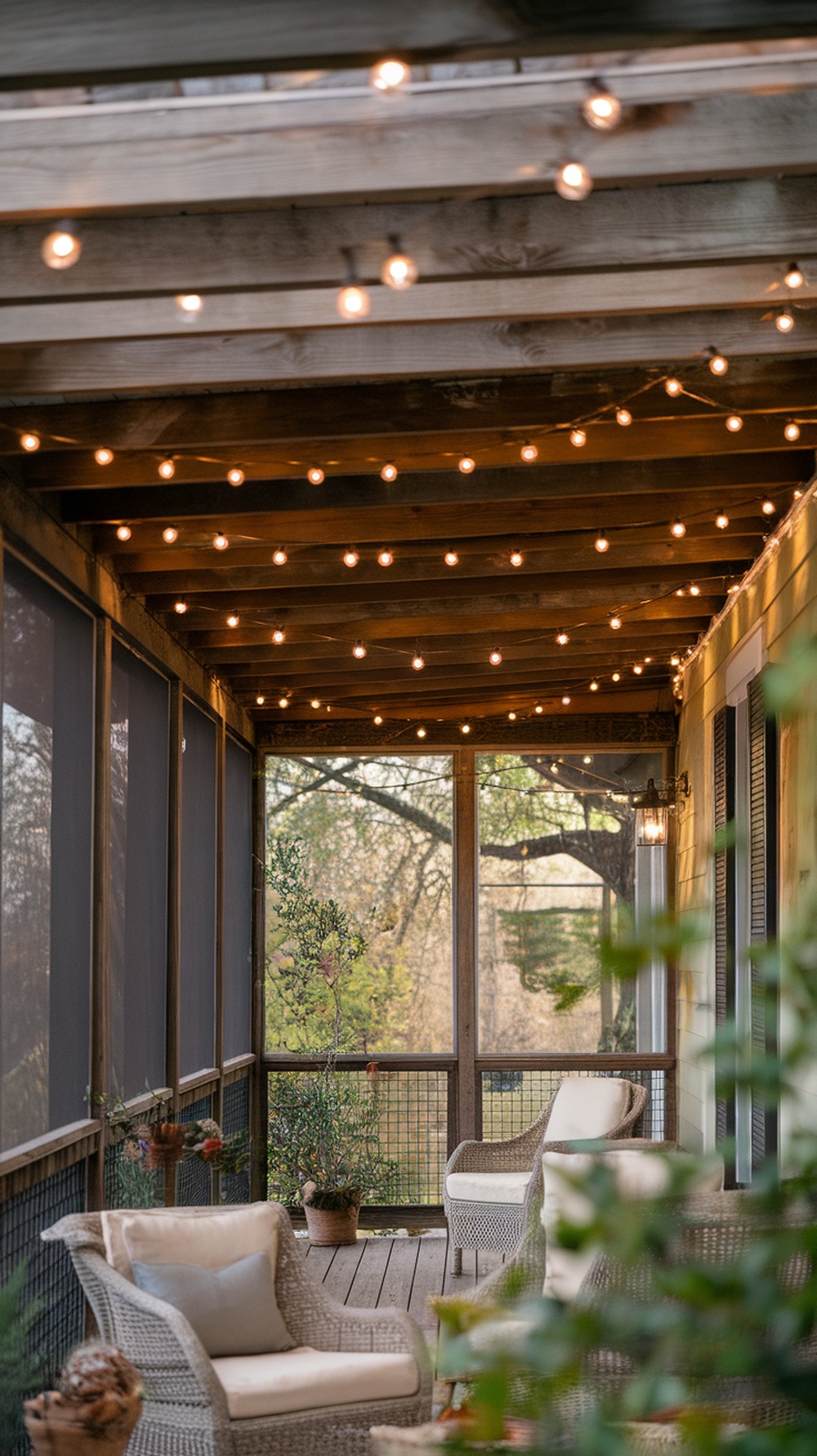
Skip the orange and purple Halloween string lights. A strand of small, warm white — not cool white — bistro or fairy lights woven along the porch beam or railing adds a soft glow that feels expensive and timeless rather than seasonal and novelty.
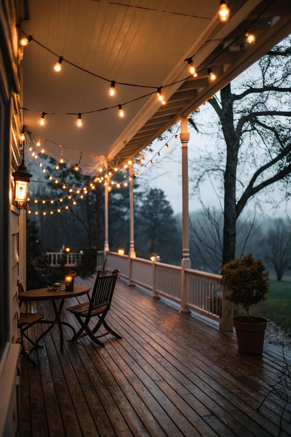
Warm light temperature is the single biggest factor in making outdoor lighting look upscale.
15. Commit to a Tight, Cohesive Color Palette
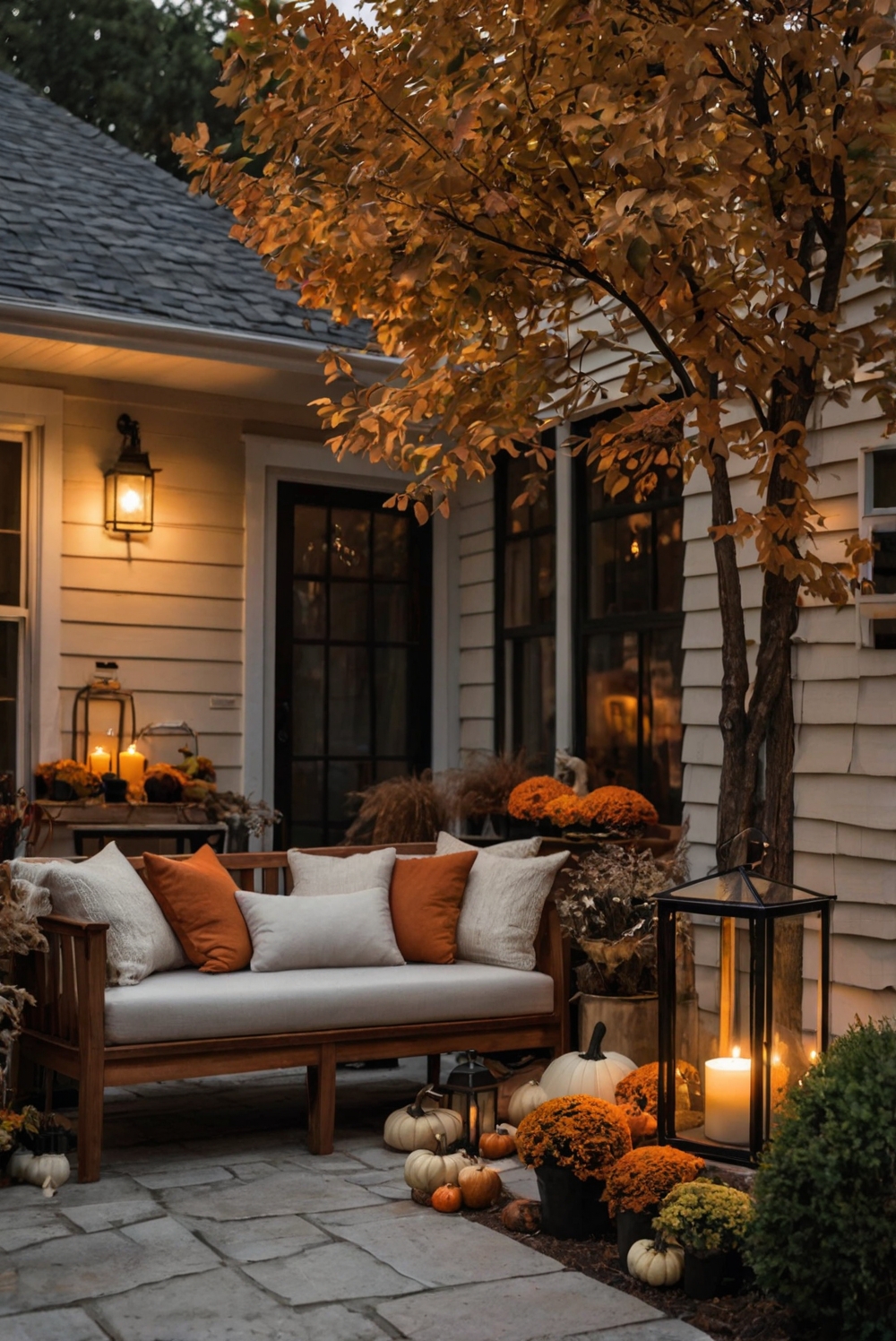
The single biggest factor separating a high-end porch from a cluttered one is color discipline. Choose two or three tones — rust, cream, and sage, or black, caramel, and cream — and apply them to every pumpkin, pillow, and plant on your porch.

A tightly edited palette photographs beautifully and reads as intentional design rather than an accumulation of seasonal buys.
16. Finish with a Fresh Eucalyptus or Foliage Swag on the Door
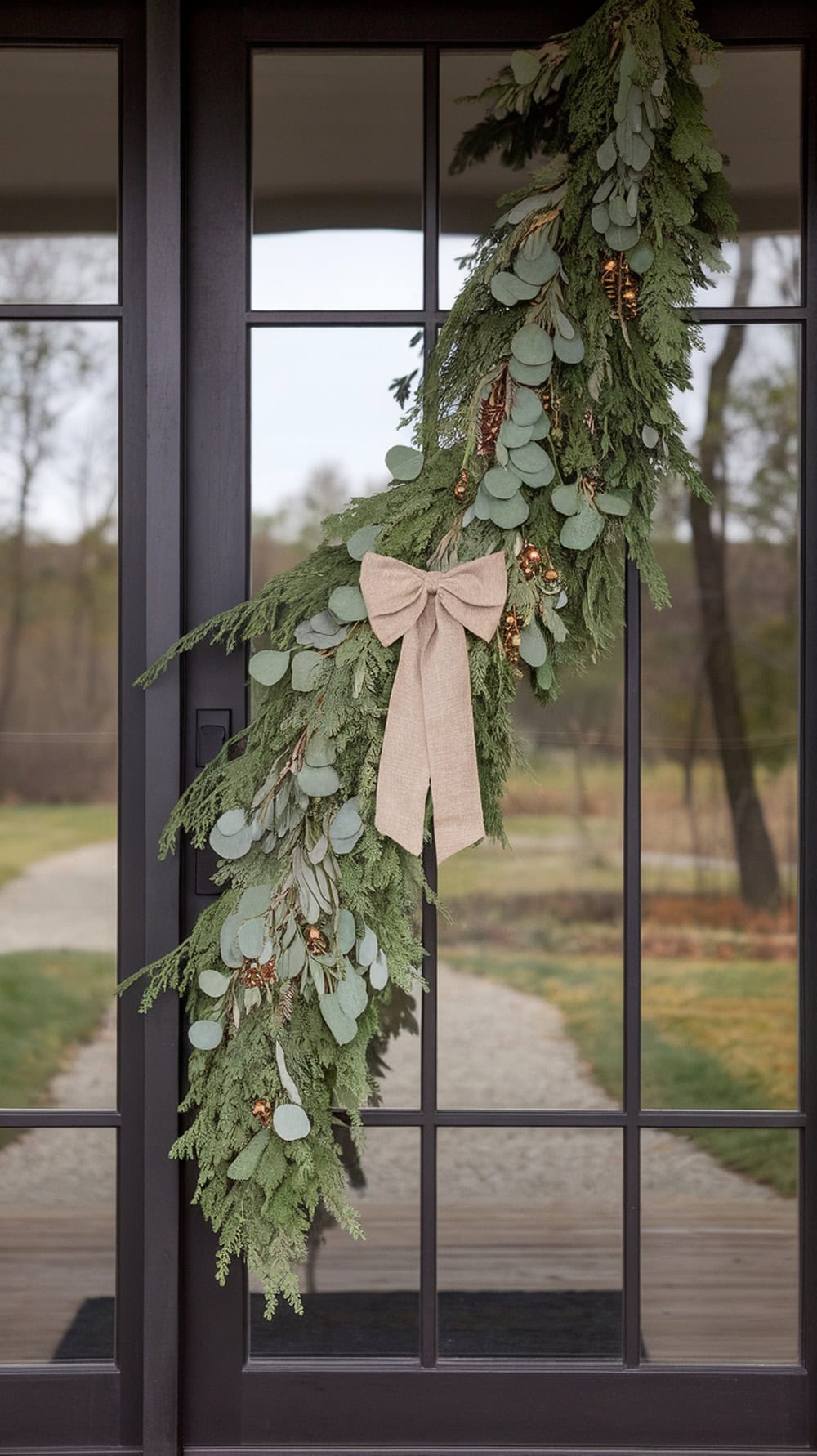
Instead of a full wreath, try a simpler asymmetrical swag of fresh or preserved eucalyptus and seasonal foliage hung with a length of velvet or linen ribbon.
This looser, more organic shape feels current and slightly undone in the best way — the kind of detail you’d see on a designer’s own front door rather than a store display.
The Takeaway
None of these ideas require a big renovation or a designer budget — they require editing. The porches that look expensive almost always share the same three habits: a restrained color palette, natural materials over plastic or dyed alternatives, and pieces that are grouped, matched, or layered rather than scattered.
Pick four or five ideas from this list that fit your existing style, commit to one color story, and resist the urge to add “just one more” seasonal item.
That restraint is what reads as curated rather than cluttered — and it’s the real secret behind every porch that looks like it belongs in a magazine.