You’re standing in the aisle at HomeGoods or scrolling endlessly on Amazon, staring at a sea of fabric swatches—taupe, navy, blush pink—and wondering, “What color should my curtains be?” We’ve all been there, friend. That moment when a simple window treatment decision feels like it’s going to make or break your entire home vibe. But here’s the good news: choosing the perfect curtain color doesn’t have to be a guessing game. By the end of this guide, you’ll have a crystal-clear framework to confidently pick curtains that elevate your space, whether it’s a cozy bedroom or a bustling living room. Let’s turn that overwhelm into “oh, that’s perfect” energy.
As an interior designer who’s helped hundreds of real people (from busy parents to first-time renters) transform their rooms without breaking the bank, I know the secret isn’t in following rigid rules—it’s in listening to what your room really needs. We’ll dive into how to choose curtain color step by step, covering everything from matching walls and furniture to creating optical illusions that make small spaces feel huge. Stick with me, and you’ll never second-guess a swatch again.
What Color Should My Curtains Be? Your 5-Question Decision Framework
Forget generic advice like “always go neutral.” Instead, let’s make this personal with a quick, 5-question quiz you can do right now—grab a notebook or your phone notes app. This framework is like having me in your pocket, asking the right questions to zero in on the best curtain colors for your living room, bedroom, or any space.
- What’s the dominant color in your room right now? Look at walls, floors, and big furniture pieces. If your walls are Behr’s “Light French Gray,” note that cool undertone—curtains should complement, not clash.
- How much natural light does the room get? North-facing rooms feel dim? South-facing ones blinding? Light affects how colors read—dark curtains in a sunny spot add drama, but in a cave-like den, they swallow light.
- What’s the room’s vibe goal? Calm sanctuary? Energetic hub? Cozy nest? Colors set the mood—soft blues for zen, warm terracottas for inviting.
- How big (or small) is the space, and what’s the ceiling height? Tiny apartment? Low ceilings? Light, flowing sheers can trick the eye into expansiveness.
- Budget and lifestyle check: Renter? Pet owner? Opt for machine-washable linens from IKEA or Amazon dupes of high-end velvets—practicality wins.
Answer these, and you’re 80% there. For example, a client with a small, dimly lit office answered: gray walls, low light, productive vibe, tiny space, renter budget. We landed on creamy off-white linen sheers—voila, instant brightness without commitment.
Rule #1 You’re Probably Breaking (and How to Fix It)
Here’s what most designers won’t tell you: The biggest curtain color rule you’re likely ignoring isn’t about trends—it’s about ignoring your room’s undertones. Undertones are those sneaky warm (yellow/red) or cool (blue/gray) hints in your existing palette that can make a “neutral” curtain look off.
The fix? Hold swatches against your walls and furniture in your room’s lighting—not the store’s fluorescents. A “safe” beige might pull pinkish on cool gray walls, turning cozy into chaotic. Pro tip: Test at different times of day. One client swapped taupe for a cooler “Sherwin-Williams Agreeable Gray” match, and her living room went from blah to balanced. For renters, use clip-on rings for easy swaps—no holes needed.
Match Curtains to Walls? Furniture? Trim? Here’s the Real Answer
Ah, the eternal debate: Should you match curtains to walls or furniture? The real answer? Neither—harmonize with both, but prioritize the element that “speaks” loudest. If your walls are bold (say, Farrow & Ball’s “Hague Blue”), echo that depth in velvet curtains but soften with a lighter shade to avoid overwhelm. Furniture dominant? Like a leather sofa in cognac? Pull a subtle thread—muted mustard linen curtains tie it in without stealing the show.
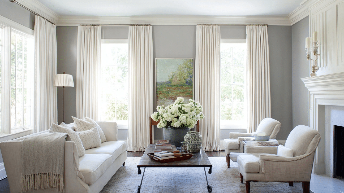
Don’t forget trim and ceilings! White trim begs for contrast—think soft sage against crisp edges. Low ceilings? Match curtains to walls for seamless height illusion. A real-room example: Gray walls (Benjamin Moore “Revere Pewter”) with a navy sectional— we chose creamy white sheers that blended walls but nodded to the sofa’s cool tones. Result? Airy magic on a budget from Amazon basics.
Finding the Perfect Curtain Color for Gray Walls – The Painted Hinge
How Curtain Color Changes Room Size & Light (with Examples)
Curtain colors aren’t just pretty—they’re optical wizards. Light colors reflect sunlight, making rooms feel bigger; dark ones absorb it, adding intimacy. In a small bedroom, heavy navy velvet shrinks the space (before: cramped cave). Swap to sheer ivory linen? After: Walls recede, ceilings lift, room breathes (optical illusion via diffused light).
For dark rooms, pale yellow or blush sheers bounce ambient glow—transforming a north-facing den from gloomy to golden-hour cozy. Example: A client’s 10×12 living room with low light felt poky with chocolate brown panels. We switched to Behr “Whisper White” in lightweight cotton—boom, 20% “bigger” vibe. Ceiling height hack: Hang high and wide for taller illusion; patterns add width.
Before & after scenario: Imagine a compact apartment kitchen with espresso curtains—feels boxed in. Replace with sunny lemon sheers: Windows widen visually, counters brighten. Budget note: IKEA’s Vivan line ($10/panel) does this trick renter-friendly.

Dark vs Light Curtain Colors: Which is Better for You?
The Mood Palette: Calm, Energizing, Luxe, Cozy, Modern
Colors whisper moods—let’s decode your palette. For calm: Soft lavenders or seafoam greens in linen (think spa retreat). Energizing? Bold corals or sunny yellows in cotton blends—perfect for home offices.
Luxe vibes scream deep emeralds or plums in velvet—pair with metallics for that “I hired a pro” feel. Cozy? Warm terracottas or buttery golds in blackout fabrics hug the room like a blanket. Modern? Crisp grays or blacks in geometric patterns—solids for minimalism, subtle stripes for edge.
What most won’t tell you: Mix textures for depth—velvet solids with sheer underlayers. A cozy bedroom example: Deep blue velvet for romance, layered over white sheers for daytime softness.
Blue Bedroom Ideas from Light Blue to Deep Navy and In Between
Living Room Curtain Colors That Always Work
Living rooms are social hubs, so best curtain colors for living room play nice with gatherings. Timeless winners: Soft neutrals like oatmeal or dove gray—versatile for any sofa swap. For pop, try muted olive in patterned linen if furniture is neutral.
Real example: Behr “Creamy White” walls + Farrow & Ball “Skylight” (pale blue) curtains = airy magic, making a standard 15×20 space feel expansive. Blackouts for movie nights? Charcoal gray velvets add sophistication without dimming vibes. Renter hack: Amazon’s Nicetown panels ($20) mimic custom in these shades.
Bedroom Curtain Colors for Better Sleep & Romance
Bedrooms crave serenity—best curtain colors for bedroom lean restful. For sleep: Cool blues or greens in blackout linen (blocks 90% light for deeper Zzzs). Romance? Soft pinks or deep burgundies in velvet—warm, inviting glow.
Example: A couple’s master with Sherwin-Williams “Sea Salt” walls got romantic with dusty rose sheers over blackouts—daytime ethereal, nighttime intimate. Avoid bright reds (too stimulating). Budget: Target’s Threshold line offers these in affordable fabrics.
Small Room? Dark Room? Here Are the Only Colors That Save You
Tiny space savior: Light neutrals like ecru or pale gray in sheers—curtains that make a room look bigger by blurring boundaries. Dark room? Warm lights—soft yellow or peach reflect scarce rays.
Example: A 8×10 home office, dim and cramped, transformed with Benjamin Moore “Pale Oak” matching curtains—visual expansion. For patterns: Subtle vertical stripes elongate. What designers won’t say: Skip solids in small spots; light patterns add dimension without clutter.
Blackout Curtains in My Bedroom Were Sabotaging My Sleep …
Timeless Colors vs Trendy Colors (and the 80/20 Rule We Swear By)
Timeless: Whites, grays, beiges—endure trends. Trendy: Jewel tones like sapphire or mustard—fun but fleeting. Our 80/20 rule: 80% timeless base (solid neutrals), 20% trendy accents (patterned panels or tiebacks).
Example: Timeless off-white linen with 2025’s trendy sage trim—fresh yet forever. Avoid all-trend pitfalls; mix for longevity.
The Biggest Mistakes 95% of People Make (and How to Avoid Them)
Cheeky truth: Most grab “safe” white without testing—ends up sterile. Mistake #1: Ignoring lighting—curtains shift hues. Fix: Swatch test.
#2: Matching exactly to walls—boring flatness. Harmonize instead.
#3: Forgetting function—pretty patterns but no blackout for bedrooms. Prioritize needs.
#4: Overlooking scale—bold in big rooms, subtle in small.
#5: Skipping layers—sheers + drapes for versatility.
Avoid by using our framework—easy peasy.
Bonus: Quick Cheat-Sheet Chart
Here’s a simple markdown table for curtain color rules in interior design: Wall color → best curtain matches.
| Wall Color | Best Curtain Colors | Why It Works | Fabric Tip |
|---|---|---|---|
| White/Off-White | Soft Gray, Blush, Navy | Adds depth without overwhelm | Sheer linen for airiness |
| Gray | Creamy White, Sage, Charcoal | Balances cool tones | Velvet for luxe |
| Blue | Ivory, Gold, Deep Teal | Complements without clashing | Blackout for sleep |
| Beige/Warm Neutral | Terracotta, Olive, White | Warms up the space | Patterned cotton for fun |
| Bold (e.g., Green) | Neutral Taupe, Matching Lighter Shade | Tones down intensity | Solid for calm |
“What If I Have [Specific Problem]?” Rapid-Fire Answers
- Patterned furniture? Solids in a pulled color—e.g., stripe from sofa in curtain hue.
- High ceilings? Darker colors ground the space; hang from ceiling for drama.
- Kids/pets? Durable poly blends in mid-tones hide dirt.
- Mix patterns and solids? Yes—scale differs (big pattern furniture, small on curtains).
- Renter with ugly windows? Floor-length neutrals distract.
- Budget under $50? Amazon basics in timeless whites.
FAQs
- Should curtains be lighter or darker than walls? Lighter for bigger feel, darker for coziness—depends on goal.
- What color curtains go with gray walls? Creamy whites or soft blues for fresh; charcoals for moody.
- Can I mix patterns and solids? Absolutely—keep scales varied for harmony.
- How to choose curtain color for a dark room? Light reflectors like pale yellows or whites.
- Best curtain colors for living room with lots of light? Mid-tones like greens to filter without dimming.
- Curtains that make a room look bigger? Sheers in wall-matching lights.
- Match curtains to walls or furniture? Harmonize both, prioritize dominant.
- Timeless vs trendy curtain colors? Stick to 80/20 for balance.
Wrapping It Up: Your Curtain Color Confidence Boost
There you have it—the full scoop on what color your curtains should be, from our 5-question framework to avoiding those sneaky pitfalls. Remember, it’s about your room’s story, not perfection. Recap: Assess undertones, mood, size, light, and lifestyle—then pick with purpose.
Now, snap a photo of your space and drop it in the comments—I’ll give personalized tweaks like your stylish best friend would. You’ve got this; go make those windows wow!

Laurie Neel Hamilton is a creative DIY expert and the author behind the charming home décor content on Vivyro.com. Passionate about empowering women to craft beautiful, personalized spaces on a budget, she shares inspiring DIY projects, inventive décor ideas, and easy-to-follow tutorials that bring warmth and style to any home.
As a proud Gigi to five beautiful grandchildren and the heart of her creative community, Laurie infuses her work with joy, creativity, and family-inspired touches. Her welcoming approach makes DIY accessible and fun for crafters of all levels, encouraging everyone to unleash their inner artist and create stunning, heartfelt décor that reflects their unique story.