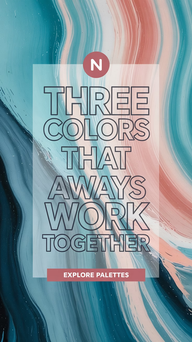
Color can completely transform the feel of a room, an outfit, or a brand. But choosing the right three-color combination can be tricky. The right trio should feel balanced, intentional, and visually harmonious. Whether you’re decorating your home, designing a website, or planning your wardrobe, understanding three colors that go together will help you create beautiful and cohesive aesthetics.
In this guide, we’ll explore 10 stunning three-color combinations—along with how you can use them in real life.
Key Facts About Three-Color Combinations
- Triadic color schemes use three evenly spaced colors on the color wheel (like red, blue, and yellow).
- Analogous combinations use colors next to each other (like blue, teal, and green).
- Choosing a dominant color and two accents creates visual balance.
- Always test the colors in the real context (wall paint, fabric swatch, screen tone).
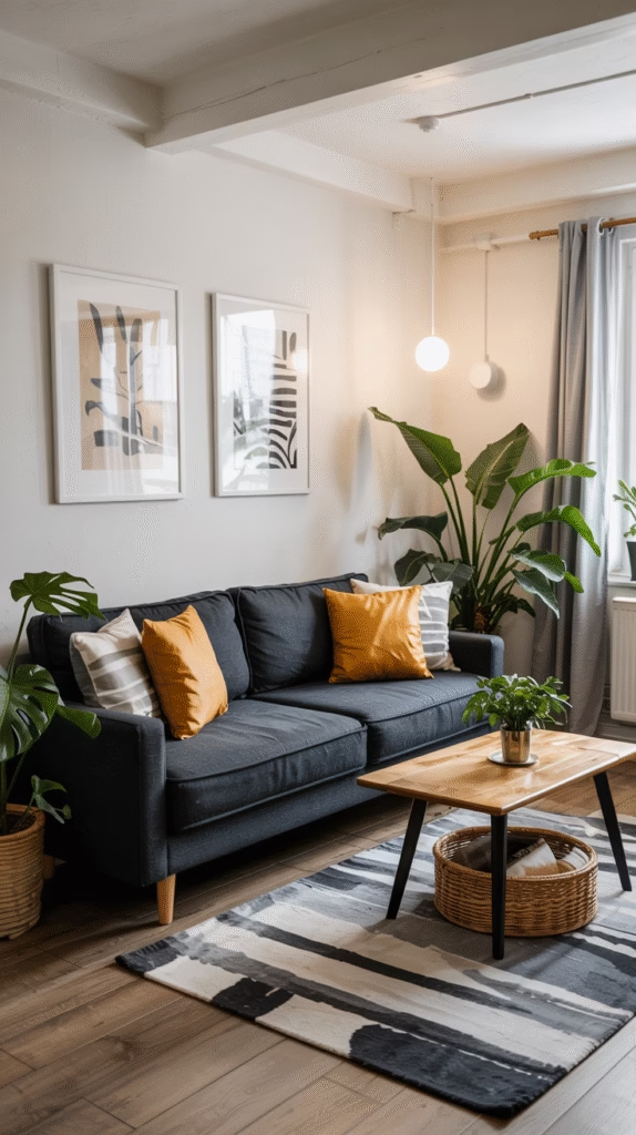
1. Navy Blue, Mustard Yellow, and White
Style: Classic, Bold, Clean
This combo is ideal for home interiors and fashion. The deep navy adds depth, mustard gives warmth and vibrancy, and white balances everything out with freshness.
- Use it for: Living room decor, branding, or fall fashion
- Pro Tip: Use navy for large elements (sofas or walls), mustard as the accent (pillows, accessories), and white as a neutral background.
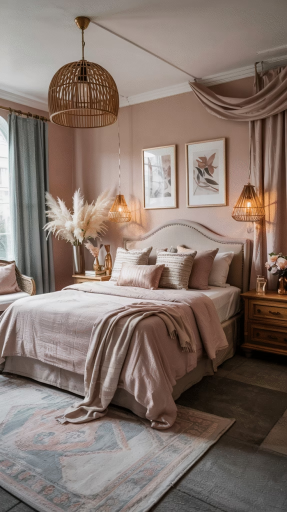
2. Blush Pink, Sage Green, and Gold
Style: Soft, Elegant, Natural
A romantic and earthy palette, perfect for weddings, feminine websites, or cozy bedrooms. Blush pink brings warmth, sage green calms, and gold adds a luxe touch.
- Use it for: Event styling, logos, or vintage-style interiors
- Pro Tip: Mix matte and metallic textures to add dimension.
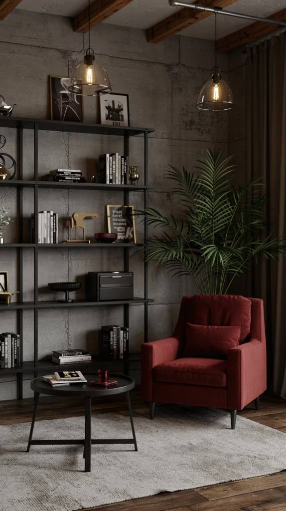
3. Black, Red, and Gray
Style: Modern, Powerful, Sophisticated
This bold and edgy combo works great in urban-themed interiors, websites, and tech branding. Red energizes, black grounds, and gray smooths the contrast.
- Use it for: Men’s fashion, websites, or gaming rooms
- Pro Tip: Use red sparingly to avoid visual overload.
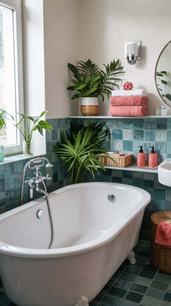
4. Teal, Coral, and White
Style: Vibrant, Beachy, Friendly
This tropical palette feels playful yet stylish. Teal evokes water, coral brings cheer, and white adds lightness.
- Use it for: Summer outfits, beach house decor, or skincare branding
- Pro Tip: Try this palette in stripes or geometric patterns.
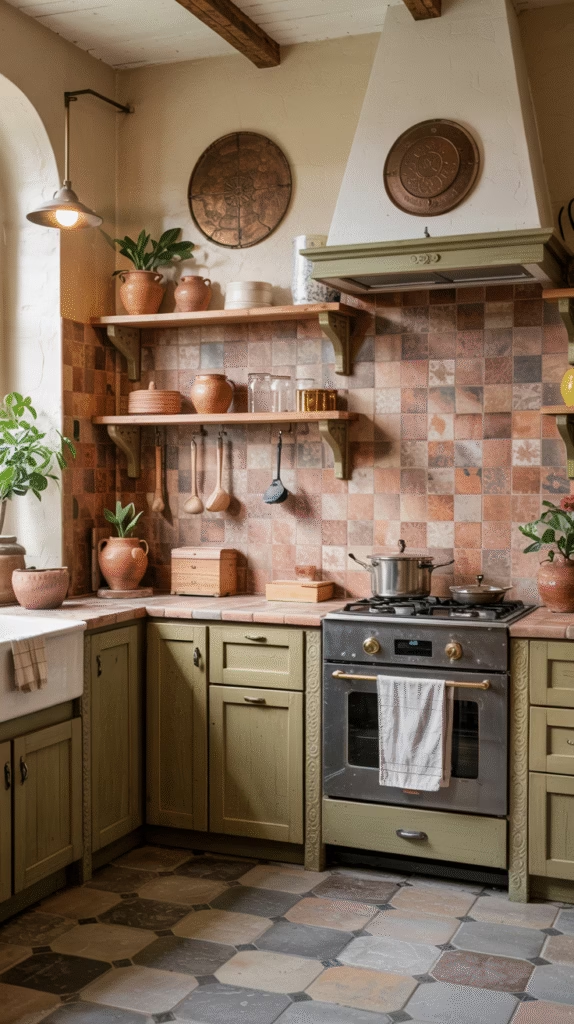
5. Terracotta, Olive Green, and Cream
Style: Earthy, Warm, Boho
Rooted in natural tones, this trio is cozy and grounding. Terracotta gives rustic charm, olive adds calm, and cream softens the look.
- Use it for: Kitchen decor, rustic branding, fall outfits
- Pro Tip: Mix textures like clay, wood, and linen to elevate the scheme.
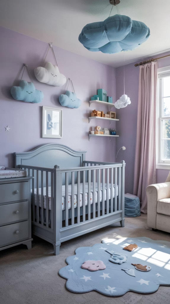
6. Lavender, Sky Blue, and Soft Gray
Style: Calm, Dreamy, Minimal
Perfect for calming environments or serene designs. These colors feel airy and youthful.
- Use it for: Baby nurseries, spa branding, or spring fashion
- Pro Tip: Pair with plenty of natural light and soft fabrics.
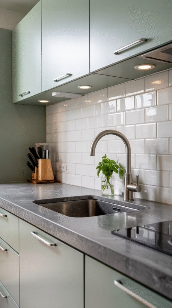
7. Charcoal, Mint Green, and White
Style: Refreshing, Modern, Minimalist
This combo balances a dark neutral (charcoal) with a pop of mint for a clean and sophisticated result.
- Use it for: Modern kitchens, UI design, or product packaging
- Pro Tip: Use mint to highlight focal points like cabinets or buttons.
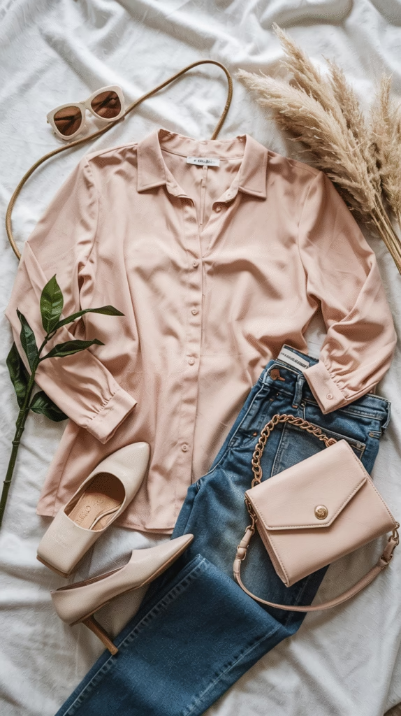
8. Peach, Denim Blue, and Ivory
Style: Casual, Chic, Airy
A charming and versatile palette that feels laid-back but intentional. Great for modern-vintage aesthetics.
- Use it for: Fashion styling, branding, or guest rooms
- Pro Tip: Ivory backgrounds keep the palette from feeling too sweet.
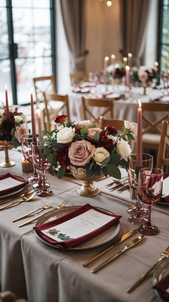
9. Burgundy, Dusty Rose, and Taupe
Style: Romantic, Sophisticated, Muted
This refined palette suits formal settings and elegant aesthetics. Burgundy adds depth, dusty rose brings softness, and taupe grounds the look.
- Use it for: Weddings, editorials, or boutique branding
- Pro Tip: This palette works beautifully in velvet and matte finishes.
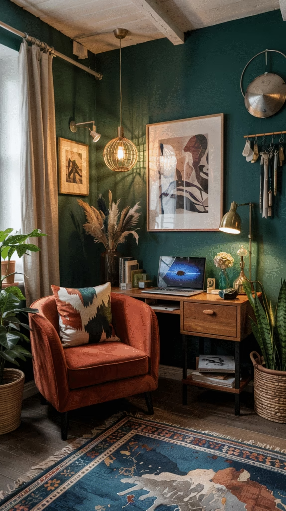
10. Emerald Green, Burnt Orange, and Cream
Style: Rich, Moody, Artistic
This dynamic trio is bold yet balanced. Emerald feels lush, burnt orange brings energy, and cream ties it together.
- Use it for: Living rooms, eclectic fashion, or artistic posters
- Pro Tip: Use cream walls or canvas to let bold tones pop.
FAQs – Three Colors That Go Together
Q1: How do I know if three colors go together?
A: Use the color wheel. Try triadic, analogous, or complementary schemes. Test them together in your setting before finalizing.
Q2: What’s the best way to apply three-color schemes?
A: Use the 60-30-10 rule: 60% dominant color, 30% secondary, 10% accent.
Q3: Can I use bold and muted colors together?
A: Yes! Balance is key. Pair bold shades with muted neutrals like cream, gray, or taupe.
Q4: What are popular color trios for modern homes?
A: Navy/Mustard/White, Terracotta/Olive/Cream, and Charcoal/Mint/White are trending.
Q5: Do these schemes work for websites and branding too?
A: Absolutely. These trios are versatile and adaptable for digital use—just adjust brightness for screens.
Conclusion
Choosing three colors that go together doesn’t have to be overwhelming. Whether you love earthy tones, modern minimalism, or vibrant contrasts, there’s a perfect trio out there for your style and purpose. The key is to balance intensity, contrast, and harmony while considering the context—be it a room, a brand, or an outfit.
Let these 10 beautiful color combinations inspire your next creative project, and don’t be afraid to tweak shades until they feel just right!

Jen Moser is a skilled kitchen and bath designer at Wisconsin Building Supply in Appleton, WI, and the author behind the expert remodeling and design content on Vivyro.com. With years of hands-on experience in residential cabinetry, layout planning, and functional aesthetics, she shares practical tips, innovative ideas, and inspiring transformations to help homeowners create beautiful, efficient kitchens and bathrooms that suit their lifestyle and budget.
As the creative voice of Vivyro.com, Jen draws from her professional expertise to offer step-by-step guidance, trend insights, and real-world solutions for remodeling projects. Her approachable, detail-oriented style empowers DIY enthusiasts and homeowners alike to achieve professional-quality results in their own spaces.